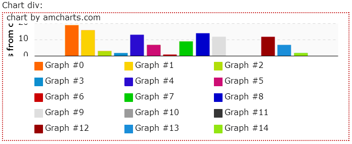
Chart legend is a great visual tool that makes charts event more usable and easy to comprehend. However, sometimes it's size gets unpredictable. If there are a lot of items in the legend, the actual chart gets shrunk in order to accommodate space for the legend. This may lead to unattractive situations like this:

Ain't pretty, right?
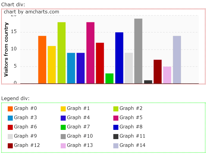
The solution to this kind of mess is putting the legend outside of the chart area altogether into a totally different div, which you can style, position and even control using CSS or JavaScript.
Let's create two separate divs: one for the chart and the other for legend:
<div id="chartdiv" style="height: 250px; border: 2px dotted #c33; margin: 5px 0 20px 0;"></div>
<div id="legenddiv" style="border: 2px dotted #3f3; margin: 5px 0 20px 0;position: relative;"></div>
Now, when we add the legend to the chart using chart.addLegend(), we specify and id of the legend div as a second parameter:
chart.addLegend(legend, "legenddiv");If you're using JSON-based chart config use "divId" property:
legend: {
  divId: "legenddiv"
}
And voila!

Additionally, if you have some space constraints, you can put width and height CSS on the legend as well as set overflow: auto so that legend is constrained to certain dimensions and the scrollbars appear if the content does not fit.
Here's a link to a live example.