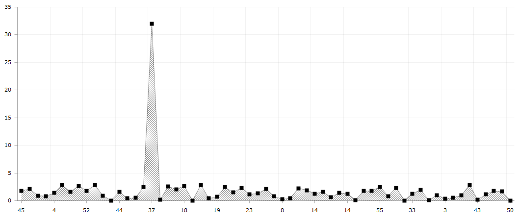
DataViz Tip #10: Verify Your Data
“Unlike a misspelled word in a story, one wrong number discredits the whole chart.”
~ Dona M. Wong “The WSJ Guide to Information Graphics”
Sometimes you discover a wild outlier in your data when you visualize it. In some cases, this may be a valuable insight, but more often than not it’s just a side-effect of a faulty data-point. You should always double-check your data and visualizations based on it, but you should be especially suspicious when you see something out of the ordinary before exposing it to your end-users.
Here are a few common issues to look out for:
- Insufficient data to make generalizations and aggregations. For example, say you are displaying pageviews-per-visitor to your website grouped by country. In some smaller countries, you may have only one visitor, and that person may have browsed through an extraordinarily high number of pages. Whenever you do such visualizations, consider filtering out data that doesn’t cross a meaningful threshold.
- Incorrect date anchoring. Suppose you are visualizing a change in some value since yesterday or last month. A common mistake is to calculate “yesterday” based on your web server’s current data or even a date on client’s machine. You should always base such visualization on the dates in your dataset and not an outside world.
- Percentages vs. fractions. Changes in data over time or shares of a whole are often expressed either in percentages or fractions/indices. Make sure that you are displaying the right format. There’s a big difference between 0.2% and 20% growth.
- Parts not adding up to a whole. Make sure that no parts are missing when you calculate percentages of a whole. A common mistake is to aggregate data by some field not every record has and then calculate the total including all of the records.
These are only a few examples of how faulty data can sneak in and spoil your charts. The important thing to remember is to always double and triple-check the accuracy of your visualizations before publishing.
