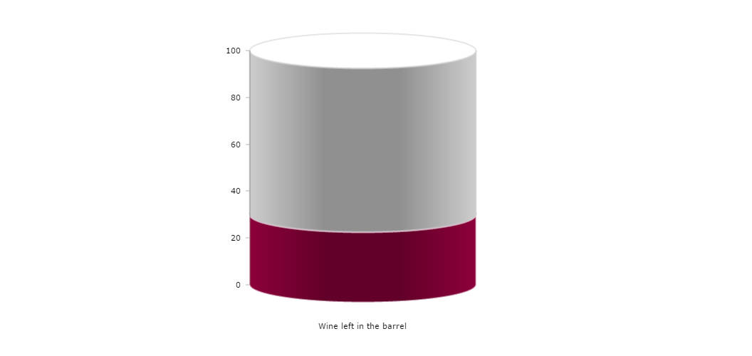
Cylinder gauge
Cylinder gauge is actually a simple serial chart with a single series and two column graphs stacked on each other. The only trick which is made here – showOnAxis property of both graphs is set to true. This makes the cylinder center to start on the 0 value of the axis (by default front of a cylinder is placed there).
Demo source
<!-- Styles -->
<style>
#chartdiv {
	width		: 100%;
	height		: 500px;
	font-size	: 11px;
}
</style>

<!-- Resources -->
<script src="https://www.amcharts.com/lib/3/amcharts.js"></script>
<script src="https://www.amcharts.com/lib/3/serial.js"></script>
<script src="https://www.amcharts.com/lib/3/plugins/export/export.min.js"></script>
<link rel="stylesheet" href="https://www.amcharts.com/lib/3/plugins/export/export.css" type="text/css" media="all" />

<!-- Chart code -->
<script>
var chartData = [ {
  "category": "Wine left in the barrel",
  "value1": 30,
  "value2": 70
} ];


var chart = AmCharts.makeChart( "chartdiv", {
  "theme": "none",
  "type": "serial",
  "depth3D": 100,
  "angle": 30,
  "autoMargins": false,
  "marginBottom": 100,
  "marginLeft": 350,
  "marginRight": 300,
  "dataProvider": chartData,
  "valueAxes": [ {
    "stackType": "100%",
    "gridAlpha": 0
  } ],
  "graphs": [ {
    "type": "column",
    "topRadius": 1,
    "columnWidth": 1,
    "showOnAxis": true,
    "lineThickness": 2,
    "lineAlpha": 0.5,
    "lineColor": "#FFFFFF",
    "fillColors": "#8d003b",
    "fillAlphas": 0.8,
    "valueField": "value1"
  }, {
    "type": "column",
    "topRadius": 1,
    "columnWidth": 1,
    "showOnAxis": true,
    "lineThickness": 2,
    "lineAlpha": 0.5,
    "lineColor": "#cdcdcd",
    "fillColors": "#cdcdcd",
    "fillAlphas": 0.5,
    "valueField": "value2"
  } ],

  "categoryField": "category",
  "categoryAxis": {
    "axisAlpha": 0,
    "labelOffset": 40,
    "gridAlpha": 0
  },
  "export": {
    "enabled": true
  }
} );
</script>

<!-- HTML -->
<div id="chartdiv"></div>