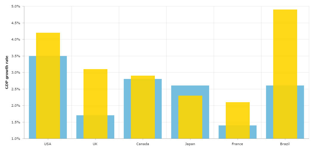
Layered Column Chart
With amCharts library you can easily produce layered column or bar chart with any number of layers. The trick is simple, you should set clustered property of a graph to false. Besides that you might want to make columns of the graph more narrow – set columnWidth to a smaller than default value, like 0.5.
Demo source
<!-- Styles -->
<style>
#chartdiv {
	width		: 100%;
	height		: 500px;
	font-size	: 11px;
}
</style>

<!-- Resources -->
<script src="https://www.amcharts.com/lib/3/amcharts.js"></script>
<script src="https://www.amcharts.com/lib/3/serial.js"></script>
<script src="https://www.amcharts.com/lib/3/plugins/export/export.min.js"></script>
<link rel="stylesheet" href="https://www.amcharts.com/lib/3/plugins/export/export.css" type="text/css" media="all" />

<!-- Chart code -->
<script>
var chart = AmCharts.makeChart("chartdiv", {
    "theme": "none",
    "type": "serial",
    "dataProvider": [{
        "country": "USA",
        "year2004": 3.5,
        "year2005": 4.2
    }, {
        "country": "UK",
        "year2004": 1.7,
        "year2005": 3.1
    }, {
        "country": "Canada",
        "year2004": 2.8,
        "year2005": 2.9
    }, {
        "country": "Japan",
        "year2004": 2.6,
        "year2005": 2.3
    }, {
        "country": "France",
        "year2004": 1.4,
        "year2005": 2.1
    }, {
        "country": "Brazil",
        "year2004": 2.6,
        "year2005": 4.9
    }],
    "valueAxes": [{
        "unit": "%",
        "position": "left",
        "title": "GDP growth rate",
    }],
    "startDuration": 1,
    "graphs": [{
        "balloonText": "GDP grow in [[category]] (2004): <b>[[value]]</b>",
        "fillAlphas": 0.9,
        "lineAlpha": 0.2,
        "title": "2004",
        "type": "column",
        "valueField": "year2004"
    }, {
        "balloonText": "GDP grow in [[category]] (2005): <b>[[value]]</b>",
        "fillAlphas": 0.9,
        "lineAlpha": 0.2,
        "title": "2005",
        "type": "column",
        "clustered":false,
        "columnWidth":0.5,
        "valueField": "year2005"
    }],
    "plotAreaFillAlphas": 0.1,
    "categoryField": "country",
    "categoryAxis": {
        "gridPosition": "start"
    },
    "export": {
    	"enabled": true
     }

});
</script>

<!-- HTML -->
<div id="chartdiv"></div>