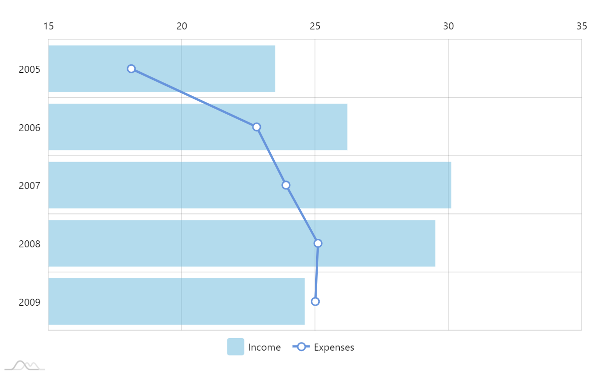
Bar and line chart mix
Mixing bar and line chart in the same visual is a good way to emphasize the difference between series while still maintaining their relationship.
In amCharts 4 it’s as easy as adding different type of series to an XYChart (in this case ColumnSeries and LineSeries)
Demo source
<!-- Styles -->
<style>
#chartdiv {
  width: 100%;
  height: 500px;
}

</style>

<!-- Resources -->
<script src="https://cdn.amcharts.com/lib/4/core.js"></script>
<script src="https://cdn.amcharts.com/lib/4/charts.js"></script>
<script src="https://cdn.amcharts.com/lib/4/themes/animated.js"></script>

<!-- Chart code -->
<script>
am4core.ready(function() {

// Themes begin
am4core.useTheme(am4themes_animated);
// Themes end

var chart = am4core.create("chartdiv", am4charts.XYChart);

chart.data = [{
        "year": "2005",
        "income": 23.5,
        "expenses": 18.1
    }, {
        "year": "2006",
        "income": 26.2,
        "expenses": 22.8
    }, {
        "year": "2007",
        "income": 30.1,
        "expenses": 23.9
    }, {
        "year": "2008",
        "income": 29.5,
        "expenses": 25.1
    }, {
        "year": "2009",
        "income": 24.6,
        "expenses": 25
    }];

//create category axis for years
var categoryAxis = chart.yAxes.push(new am4charts.CategoryAxis());
categoryAxis.dataFields.category = "year";
categoryAxis.renderer.inversed = true;
categoryAxis.renderer.grid.template.location = 0;

//create value axis for income and expenses
var valueAxis = chart.xAxes.push(new am4charts.ValueAxis());
valueAxis.renderer.opposite = true;


//create columns
var series = chart.series.push(new am4charts.ColumnSeries());
series.dataFields.categoryY = "year";
series.dataFields.valueX = "income";
series.name = "Income";
series.columns.template.fillOpacity = 0.5;
series.columns.template.strokeOpacity = 0;
series.tooltipText = "Income in {categoryY}: {valueX.value}";

//create line
var lineSeries = chart.series.push(new am4charts.LineSeries());
lineSeries.dataFields.categoryY = "year";
lineSeries.dataFields.valueX = "expenses";
lineSeries.name = "Expenses";
lineSeries.strokeWidth = 3;
lineSeries.tooltipText = "Expenses in {categoryY}: {valueX.value}";

//add bullets
var circleBullet = lineSeries.bullets.push(new am4charts.CircleBullet());
circleBullet.circle.fill = am4core.color("#fff");
circleBullet.circle.strokeWidth = 2;

//add chart cursor
chart.cursor = new am4charts.XYCursor();
chart.cursor.behavior = "zoomY";

//add legend
chart.legend = new am4charts.Legend();

}); // end am4core.ready()
</script>

<!-- HTML -->
<div id="chartdiv"></div>