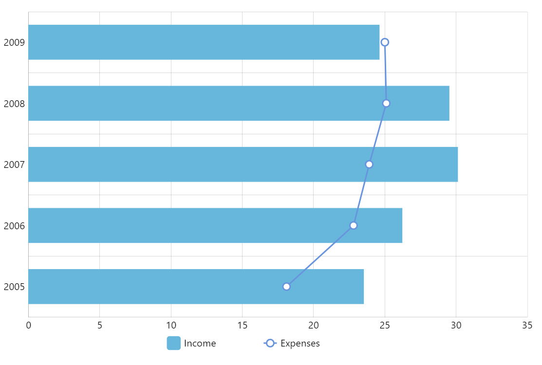
Bar and Line Chart Mix
Mixing bar and line chart in the same visual is a good way to emphasize the difference between series while still maintaining their relationship.
In amCharts 5 it’s as easy as adding different type of series to an XYChart (in this case ColumnSeries and LineSeries)
Related tutorials
Demo source
<!-- Styles -->
<style>
#chartdiv {
  width: 100%;
  height: 500px;
}
</style>

<!-- Resources -->
<script src="https://cdn.amcharts.com/lib/5/index.js"></script>
<script src="https://cdn.amcharts.com/lib/5/xy.js"></script>
<script src="https://cdn.amcharts.com/lib/5/themes/Animated.js"></script>

<!-- Chart code -->
<script>
am5.ready(function() {

// Create root element
// https://www.amcharts.com/docs/v5/getting-started/#Root_element
var root = am5.Root.new("chartdiv");


// Set themes
// https://www.amcharts.com/docs/v5/concepts/themes/
root.setThemes([
  am5themes_Animated.new(root)
]);


// Create chart
// https://www.amcharts.com/docs/v5/charts/xy-chart/
var chart = root.container.children.push(am5xy.XYChart.new(root, {
  panX: false,
  panY: false,
  wheelX: "panX",
  wheelY: "zoomX",
  paddingLeft: 0,
  layout: root.verticalLayout
}));


// Add legend
// https://www.amcharts.com/docs/v5/charts/xy-chart/legend-xy-series/
var legend = chart.children.push(am5.Legend.new(root, {
  centerX: am5.p50,
  x: am5.p50
}))

var data = [{
  "year": "2005",
  "income": 23.5,
  "expenses": 18.1
}, {
  "year": "2006",
  "income": 26.2,
  "expenses": 22.8
}, {
  "year": "2007",
  "income": 30.1,
  "expenses": 23.9
}, {
  "year": "2008",
  "income": 29.5,
  "expenses": 25.1
}, {
  "year": "2009",
  "income": 24.6,
  "expenses": 25
}];;


// Create axes
// https://www.amcharts.com/docs/v5/charts/xy-chart/axes/
var yRenderer = am5xy.AxisRendererY.new(root, {
  cellStartLocation: 0.1,
  cellEndLocation: 0.9,
  minorGridEnabled: true
});

yRenderer.grid.template.set("location", 1);

var yAxis = chart.yAxes.push(
  am5xy.CategoryAxis.new(root, {
    categoryField: "year",
    renderer: yRenderer,
    tooltip: am5.Tooltip.new(root, {})
  })
);

yAxis.data.setAll(data);

var xAxis = chart.xAxes.push(
  am5xy.ValueAxis.new(root, {
    min: 0,
    renderer: am5xy.AxisRendererX.new(root, {
      strokeOpacity: 0.1,
      minGridDistance:70
    })
  })
);


// Add series
// https://www.amcharts.com/docs/v5/charts/xy-chart/series/
var series1 = chart.series.push(am5xy.ColumnSeries.new(root, {
  name: "Income",
  xAxis: xAxis,
  yAxis: yAxis,
  valueXField: "income",
  categoryYField: "year",
  sequencedInterpolation: true,
  tooltip: am5.Tooltip.new(root, {
    pointerOrientation: "horizontal",
    labelText: "[bold]{name}[/]\n{categoryY}: {valueX}"
  })
}));

series1.columns.template.setAll({
  height: am5.percent(70)
});


var series2 = chart.series.push(am5xy.LineSeries.new(root, {
  name: "Expenses",
  xAxis: xAxis,
  yAxis: yAxis,
  valueXField: "expenses",
  categoryYField: "year",
  sequencedInterpolation: true,
  tooltip: am5.Tooltip.new(root, {
    pointerOrientation: "horizontal",
    labelText: "[bold]{name}[/]\n{categoryY}: {valueX}"
  })
}));

series2.strokes.template.setAll({
  strokeWidth: 2,
});

series2.bullets.push(function () {
  return am5.Bullet.new(root, {
    locationY: 0.5,
    sprite: am5.Circle.new(root, {
      radius: 5,
      stroke: series2.get("stroke"),
      strokeWidth: 2,
      fill: root.interfaceColors.get("background")
    })
  });
});


// Add legend
// https://www.amcharts.com/docs/v5/charts/xy-chart/legend-xy-series/
var legend = chart.children.push(am5.Legend.new(root, {
  centerX: am5.p50,
  x: am5.p50
}));

legend.data.setAll(chart.series.values);

// Add cursor
// https://www.amcharts.com/docs/v5/charts/xy-chart/cursor/
var cursor = chart.set("cursor", am5xy.XYCursor.new(root, {
  behavior: "zoomY"
}));
cursor.lineX.set("visible", false);

series1.data.setAll(data);
series2.data.setAll(data);

// Make stuff animate on load
// https://www.amcharts.com/docs/v5/concepts/animations/
series1.appear();
series2.appear();
chart.appear(1000, 100);

}); // end am5.ready()
</script>

<!-- HTML -->
<div id="chartdiv"></div>