Implementing “The Chart That Saved Trump’s Life”
We always knew that data-viz was bringing beauty and order to the world. As of July 14th, 2024 it also can claim a badge of the Secret Service officer, having successfully saved a presidential candidate’s life.
The Background
During rally, presidential candidate Donald Trump has looked away towards this chart displayed on a big screen, titled (in all caps as we come to expect) “ILLEGAL IMMIGRATION INTO THE U.S.”:
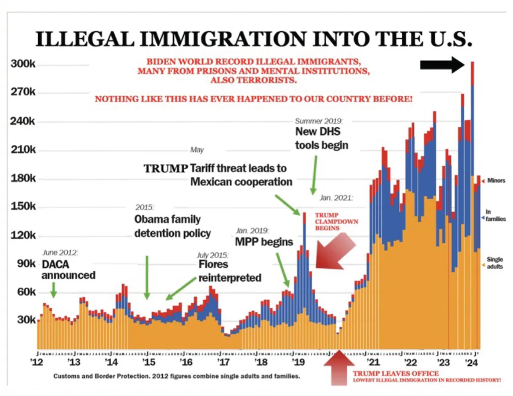
At the same time a shot, aimed at Trump’s head was fired, and missed, because he was looking away at the chart.
As he later claimed himself, the chart saved his life.
The Task
We just can’t resist giving prominent data-viz items an amCharts makeover.
Behold, a live version of the life-saving chart:
[codepen_embed height=”800″ default_tab=”result” slug_hash=”LYKpRWx” pen_title=”Column with Rotated Labels” user=”amcharts”]See the Pen
Column with Rotated Labels by amCharts team (@amcharts)
on CodePen.[/codepen_embed]
Editable Version
And should you feel creative, here’s a version of the same chart that you can manipulate the data on, by dragging the columns. Enjoy! 😉
[codepen_embed height=”800″ default_tab=”result” slug_hash=”OJeyMbE” pen_title=”Column with Rotated Labels” user=”amcharts”]See the Pen
Column with Rotated Labels by amCharts team (@amcharts)
on CodePen.[/codepen_embed]