Introducing responsive charts and maps
The release of version 3.13 marks important milestone – true responsive features. [Download]
These features come in the form of our own in-house developed plugin – first in the series. Available directly in the /plugins/responsive/ subdirectory in the ZIP archive of all amCharts products.
How does it work?
The plugin works by scaling-down and -up chart visual features based on the actual viewport available to the chart or map.
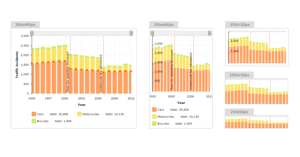
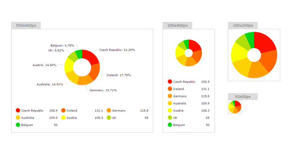
For example, a fully-featured serial chart, complete with legend, guides, axis and chart titles, etc. will scale down to accommodate smaller resolutions by removing certain elements at certain dimensions, like legend, axis titles, guides, chart titles, zoom controls, moving labels inside plot area, all the way down to a sparkline / microchart.
It will do this automatically, no need to redraw the chart or do anything on user’s part. It will even work dynamically as you resize window or chart container, or change the orientation of your mobile device.
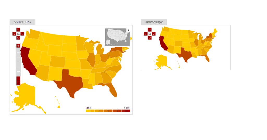
Here are a few examples:


And here’s a live demo for you:
[codepen_embed height=”570″ theme_id=”11061″ slug_hash=”4651bb8750283f762111f61021da2462″ default_tab=”result” user=”amcharts”]See the Pen Responsive serial chart by amCharts (@amcharts) on CodePen.[/codepen_embed]
What about mobile?
We’ve got you covered!
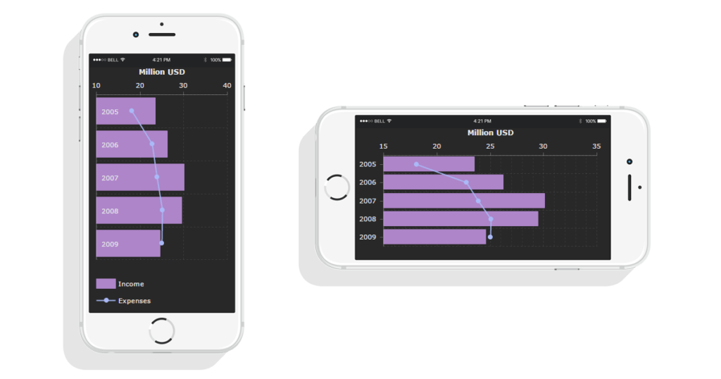
The chart will adapt to mobile resolutions just as well. Even when mobile device orientation changes (i.e. you rotate your iPhone from vertical to horizontal position), depending on how your web page is set up to behave, the responsive features will kick in to accommodate to the new resolution:

I want in! What do I do?
You will need to upgrade your JavaScript Charts, JavaScript Stock Charts or JavaScript Maps to v 3.13.
You will also need to do two steps to enable responsive features:
- Include plugin on your pages (/plugins/responsive/responsive.js)
- Enable plugin for your chart instances ( responsive: { enabled: true } )
We also suggest this tutorial for further reading: (contains much more information about plugin and how it can be used)